Why the Best Events Have a Visual Identity
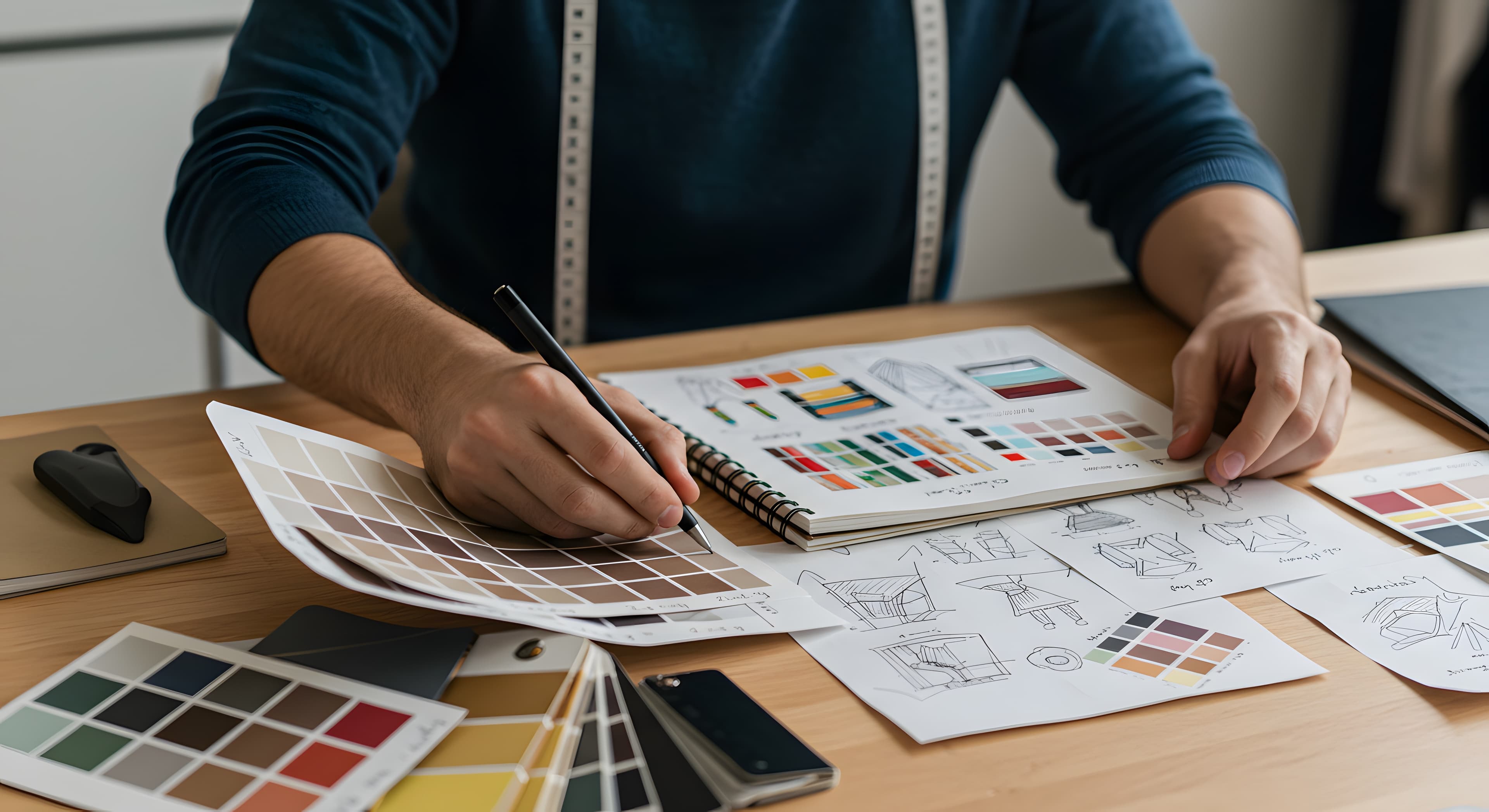
The best events feel considered before anyone walks in the door. That starts with a visual identity — color, type, and mood that cohere from the invitation through the evening.
Why the Best Events Have a Visual Identity
Think about the last event you attended that felt genuinely considered — not necessarily lavish, but intentional. The invitation looked a certain way. The table had a coherence to it. The evening had a personality that started before you arrived and carried through the entire experience.
Now think about the last event that felt thrown together. It may have been perfectly pleasant, but something was off. The invitation was generic. The décor didn't suggest a particular mood. The evening didn't have a character — it had a checklist.
The difference between these two experiences is rarely budget. It's identity. The first event had one. The second didn't.
What visual identity means for an event
Brands have visual identities — a defined palette, a typeface, a tone of voice, a set of visual choices that cohere across every touchpoint. When you see a brand's packaging, its website, and its advertising, they feel like they belong together. That coherence is what makes a brand recognizable and, more importantly, what makes it feel considered.
Events can have the same property. Not in the corporate branding sense — no one needs a logo for their dinner party. But in the sense that the visual choices made for the event share a common thread. The invitation sets a palette. The table reflects it. The atmosphere follows. The evening has a through-line that begins with the first thing the guest sees and carries through to the last.
This doesn't require a designer or a significant budget. It requires a single deliberate decision at the beginning: what does this event feel like? Once that question has an answer, the visual choices downstream become simpler, because they all point in the same direction.
The invitation is the first touchpoint
A brand's visual identity begins with its logo. An event's visual identity begins with its invitation.
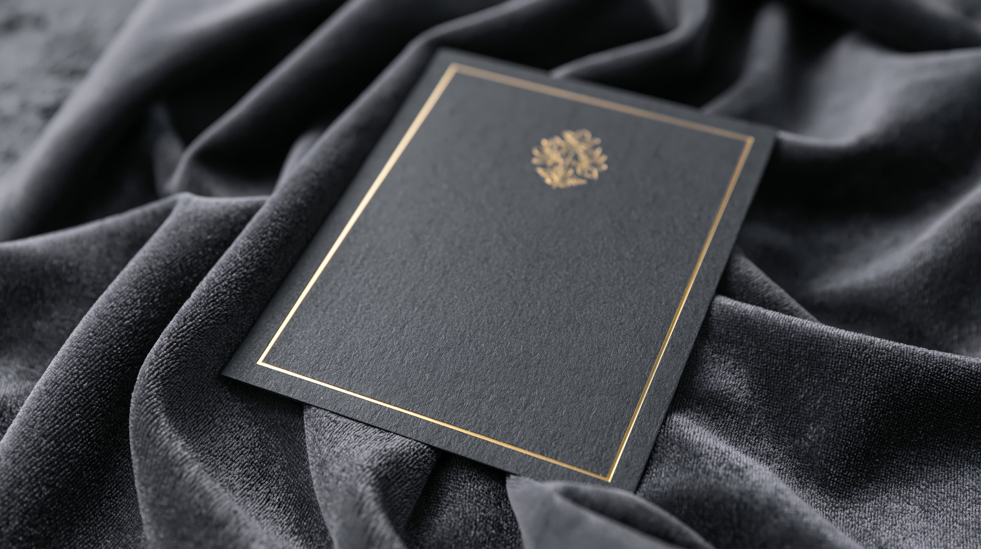
The invitation is the first artifact of the event — the first thing any guest sees, often days or weeks before the evening itself. The colors, the typography, the mood of the card are the guest's first impression of what's to come. If the invitation feels grand and formal, the guest anticipates a grand, formal evening. If it feels warm and relaxed, the expectation shifts accordingly.
This first impression is more powerful than most hosts realize. It's the reason guests ask about dress codes — the invitation told them something about the event's tone, and they want to confirm they read it correctly. It's the reason guests arrive with a certain energy — the invitation calibrated their expectations before they walked through the door.
When the invitation has a clear visual identity — a defined palette, a considered typeface, a mood that's unmistakable — it does this work automatically. The guest doesn't need to be told what kind of evening to expect. The design already told them.
Coherence, not decoration
Visual identity is sometimes confused with decoration — more flowers, more candles, a more elaborate table setting. These things can be part of a visual identity, but they're not what creates one. Decoration adds elements. Identity adds coherence.
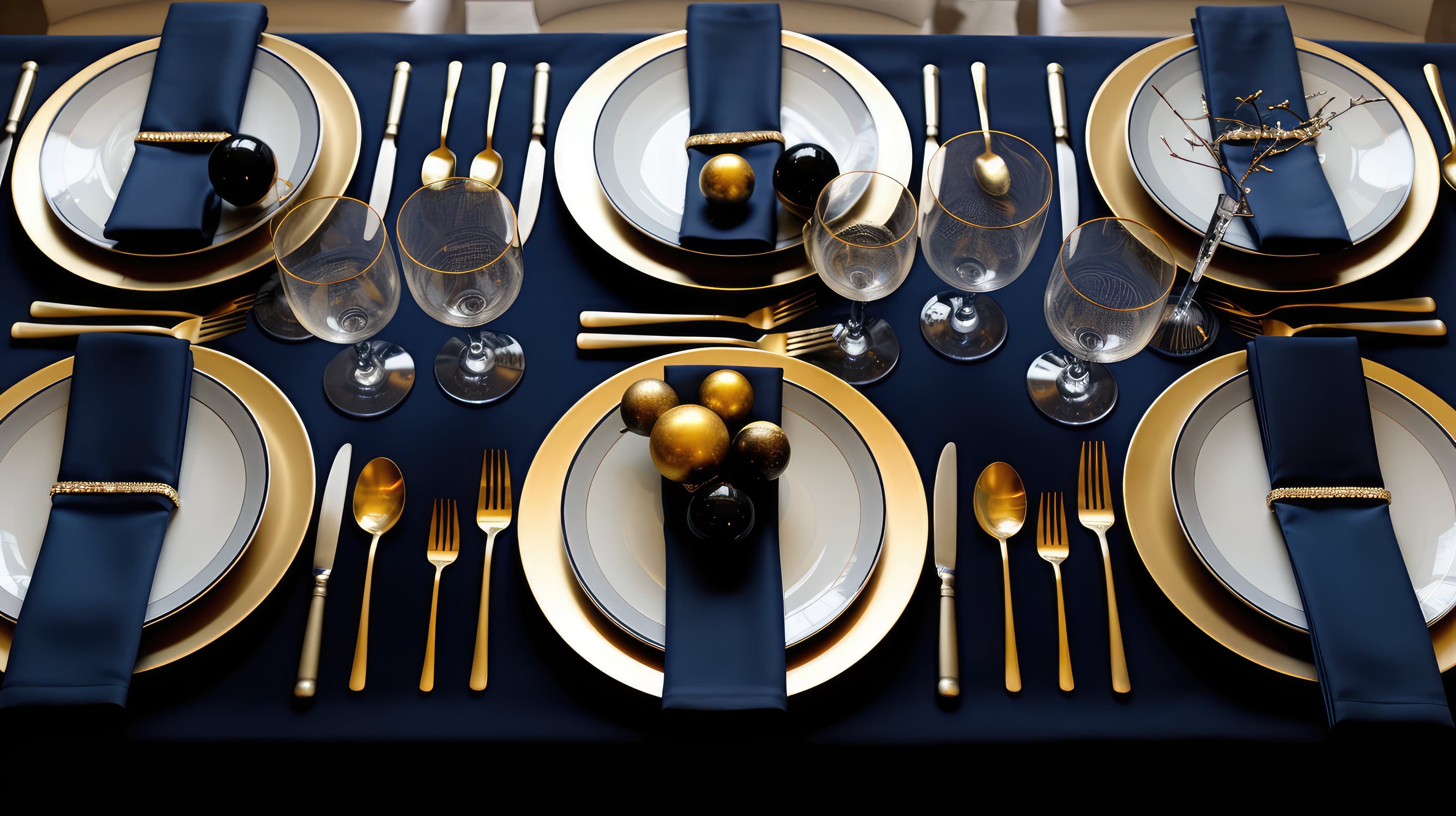
The distinction matters because coherence is achievable at any scale and any budget. A dinner party for eight with a simple table — good plates, cloth napkins, a single color running through the candles and the napkin rings — has more visual identity than a lavish party with mismatched décor that doesn't tell a story.
The coherence starts with the invitation and extends outward. If the invitation uses a warm, muted palette — dusty rose, ivory, soft gold — the table setting that echoes those tones feels connected to the invitation. The guest perceives a single considered experience, not a series of separate aesthetic decisions. The invitation, the space, and the evening feel like they belong together.
This doesn't mean the table has to match the invitation perfectly. It means the choices share a direction. A bold, dark invitation followed by a bright, pastel table creates dissonance. A bold, dark invitation followed by a warm, candlelit setting with deep tones creates continuity. The guest may not consciously register the connection, but they feel it.
The mood as the organizing principle
The simplest way to create a visual identity for an event is to name the mood.
Not the theme — not "Hawaiian luau" or "Great Gatsby." A theme prescribes specific elements that can feel forced if they're not executed with real commitment. A mood is broader and more forgiving. It's the feeling the host wants the evening to carry.
Warm and intimate. Bold and celebratory. Clean and modern. Grand and luxurious. Each of these moods implies a set of visual choices — colors, textures, lighting, materials — without prescribing a single specific element. The host who decides their evening is "warm and intimate" will naturally gravitate toward soft lighting, rich textures, close seating, and a muted palette. The host who decides their evening is "bold and celebratory" will gravitate toward vivid colors, open spaces, and energetic music.
The mood is the filter. Every decision — from the invitation design to the table setting to the playlist — passes through it. Does this choice feel warm and intimate? Then it belongs. Does this other choice feel cold and impersonal? Then it doesn't, regardless of how beautiful it is in isolation.
This is why the best events feel effortless even when significant effort went into them. The decisions cohere because they all serve the same mood. Nothing feels out of place because nothing is — every element was selected by the same filter.
Small events benefit most
There's a misconception that visual identity is for large, produced events — weddings, galas, corporate functions. In practice, smaller events benefit more from visual identity than large ones, because every element is more visible.
At a 200-person event, the individual table setting is one of many. The invitation is a formal instrument. The scale itself creates an impression, and the details matter less than the overall production.
At a dinner for 12, every detail is noticed. The card on the table. The color of the candles. The way the napkins are folded. The guest sees each element individually, and the coherence (or lack of it) between them is immediately apparent. A small, considered table with a clear visual through-line makes a stronger impression than a large, decorated room with no connecting logic.
This is also why the invitation matters more for intimate events than for large ones. At a 200-person gala, the invitation is administrative — it communicates the details and sets a general tone. At a dinner for 12, the invitation is personal — it tells each guest that the host thought about this evening specifically, and that the thought started before the table was set.
Identity as hospitality
There's a layer beneath the visual that's worth naming. A considered visual identity communicates care. Not wealth, not status, not design skill — care. It tells the guest that the host thought about the experience from end to end, that the evening didn't begin when the door opened but when the invitation was sent.
This is a form of hospitality that's often overlooked. Hosting well isn't just about good food and a clean house. It's about the feeling guests carry through the evening — the sense that someone considered what this would be like for them, from the first moment of contact to the last.
A visual identity is the simplest, most scalable expression of that care. It doesn't require money. It doesn't require training. It requires one deliberate decision about the mood of the evening, and the willingness to let that decision shape everything that follows.
Where it starts
Every Cordiale invitation begins with a mood — a vibe that sets the palette, the typography, and the visual personality of the card. That becomes the first touchpoint of the event's identity. The guest sees it and knows, before they read a word, what kind of evening to expect.
Free. Under two minutes. Create yours →
More on design and events: The Case Against Templates · What Your Invitation Says About Your Event · What Is a Vibe?
Ready to create your invitation?
Pick a vibe and the whole invitation designs itself. Free, no account, no app — for you or your guests.