What Your Invitation Says About Your Event Before Anyone Reads a Word
Color, typography, and mood tell your guests what kind of evening to expect before they read the date. Here's how design works as signal.
What Your Invitation Says About Your Event Before Anyone Reads a Word
A guest sees your invitation for the first time. Before they read the date, the address, or even the event name, they've already formed an impression. They know, within a second, whether this feels formal or relaxed, grand or intimate, traditional or modern. They know what to expect from the evening — not the details, but the character.
This happens through design. Color, typography, texture, and contrast communicate faster than language, and they communicate things that language can't easily express. A dark card with gold serif type says something different from a bright gradient with a bold sans-serif headline. Both are invitations. They signal entirely different evenings.
Most hosts don't think about this consciously. They choose a design that "looks nice" and move on. But the design is already doing work — telling guests what kind of event this is, how seriously to take it, and what version of themselves to bring. Understanding what that signal is, and choosing it intentionally, is one of the most underappreciated parts of hosting well.
Color as tone
Color is the first thing a guest registers, and it carries the most emotional weight.
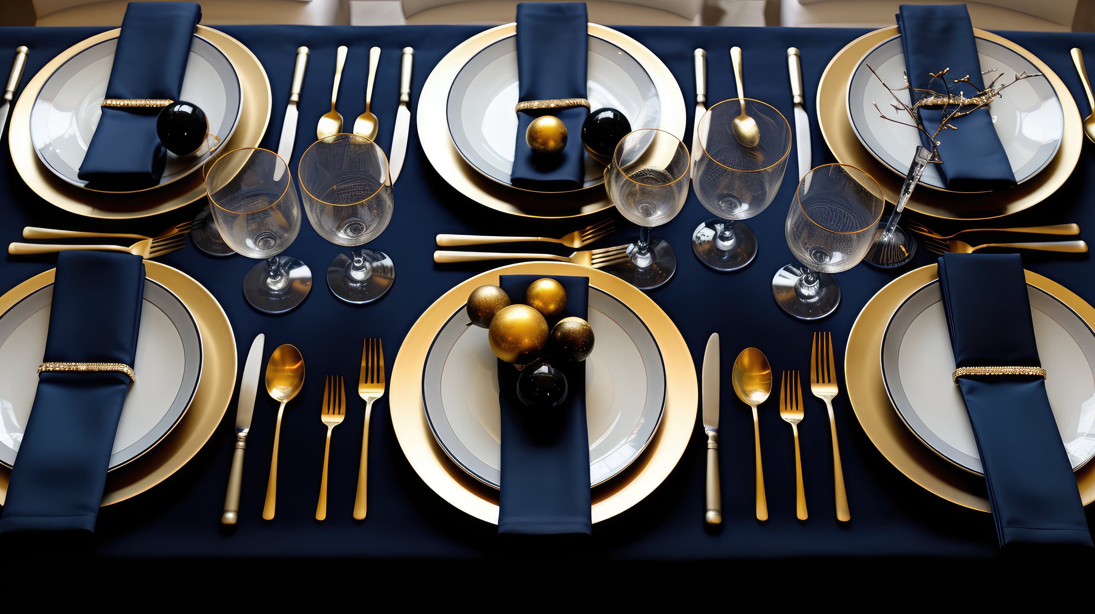
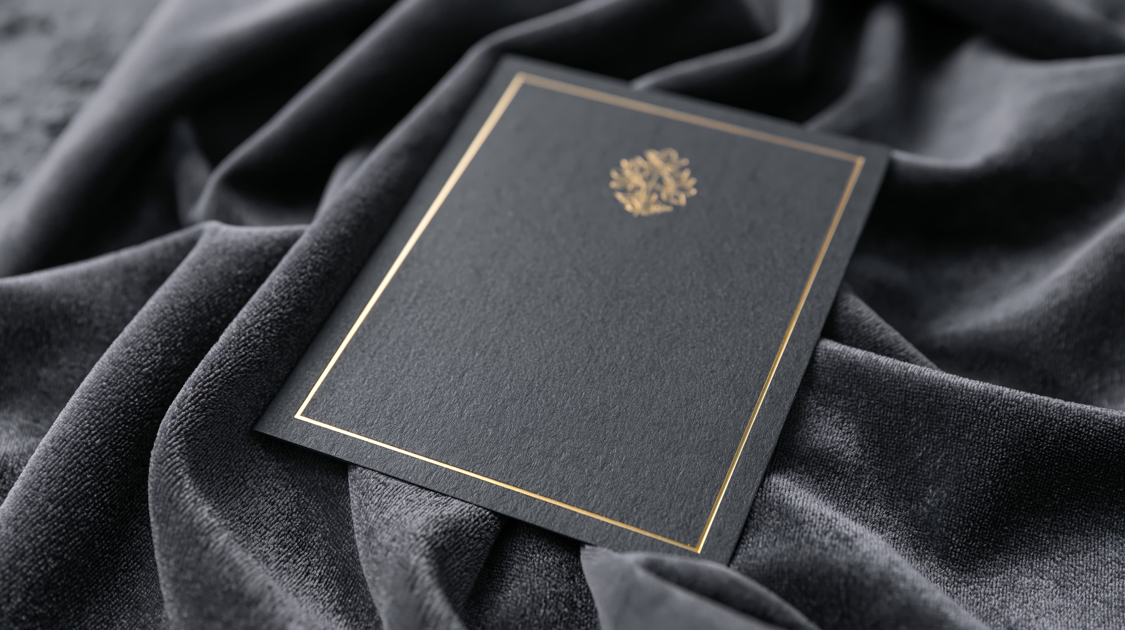
Dark palettes — deep navy, black, charcoal, rich jewel tones — signal formality, intention, and gravity. An invitation on a dark background tells a guest that the evening has a shape, that thought was put into it, that the host is curating an experience. Dark cards feel considered. They elevate the occasion.
Light palettes — soft blush, ivory, pastels, warm neutrals — signal warmth, openness, and approachability. They suggest a gathering that's welcoming and comfortable. A light card doesn't carry the weight of a dark one, which is exactly the point when the event is a relaxed dinner, a housewarming, or a daytime celebration.
Bright, saturated palettes — vivid gradients, bold contrasts, neon accents — signal energy and celebration. They're festive without needing to be formal. A bright invitation says "this is going to be fun" before the guest reads a single word.
The mistake is mismatch. A dark, formal card for a casual backyard gathering sets expectations the evening can't meet. A bright, playful card for an intimate, curated dinner undersells what the host has planned. When the design matches the event, the guest arrives calibrated. When it doesn't, the guest spends the first thirty minutes recalibrating.
Typography as personality
Fonts communicate personality with the same immediacy as color, though most people don't consciously identify what they're responding to.
Serif typefaces — Playfair Display, Lora, Garamond — carry history and formality. They read as traditional, refined, and deliberate. An invitation set in a serif font feels like it came from a host who values elegance. They're the natural choice for formal dinners, milestone celebrations, and occasions with cultural or ceremonial weight.
Sans-serif typefaces — Montserrat, Roboto, Poppins — read as modern, clean, and direct. They signal a host who values clarity over ornamentation. They suit contemporary gatherings, casual celebrations, and events where the energy is more important than the formality.
Rounded, playful typefaces — Nunito, rounded sans-serifs — carry warmth and fun. They're inherently approachable. They suit birthday parties, casual get-togethers, and any occasion where the invitation should feel like a smile.
The weight of the font matters as much as the family. Bold, heavy type commands attention and feels confident. Light, airy type feels delicate and intimate. A bold sans-serif on a dark background says "bold event." A light serif on blush says "intimate evening." Neither is better. Both are saying something.
Texture and detail as care
Beyond color and type, the subtler layers of an invitation's design communicate how much thought went into the event itself.
A card with a textured finish — a linen weave, a subtle grain, a brushed surface — feels crafted. It tells the guest that the host didn't just pick a color and a font; they considered the tactile quality of the design. This signals care, and care signals that the event itself will be considered.
A decorative frame — an illustrated border, a corner detail, an overlay that adds depth — adds formality and visual richness. Frames tell a guest that this isn't a quick announcement; it's a keepsake. They suit occasions where the invitation is part of the experience, not just a delivery mechanism for the details.
A clean card with no texture, no frame, and a single confident gradient says something different. It says the host values restraint, that the design is intentional in its simplicity, and that the event will follow suit — polished without being fussy.
Each of these is a valid choice. The question isn't which is objectively better — it's which one matches the event the host is planning.
The coherence test
The strongest invitations pass a simple test: every design element points in the same direction.
The color, the font, the texture, the frame (or absence of one), and the overall composition all say the same thing about the event. A formal dinner reads as formal across every dimension — dark palette, serif type, subtle texture, refined frame. A vibrant celebration reads as vibrant across every dimension — bold color, energetic type, clean lines, forward momentum.
When the elements disagree — a playful font on a somber background, a formal serif paired with neon colors, a heavy frame around a minimal design — the invitation sends a mixed signal. The guest doesn't know what to expect, and that uncertainty carries into the evening. It's rarely a dramatic mismatch, but it creates a subtle sense that the event hasn't quite been thought through.
This coherence is difficult to achieve by assembling individual elements yourself. Picking a color, then a font, then a texture, then a frame — each in isolation — often produces a combination where the parts are individually fine but collectively unfocused. A system that links these elements together — where the palette, the typography, and the decorative layers all derive from a single mood — produces coherence by default.
Design as hospitality
There's a deeper principle beneath all of this. The invitation is the first act of hospitality. Before the food is served, before the space is prepared, before the first guest walks in, the invitation tells them that this event was considered, that the host cared enough to set a tone, and that the evening is worth anticipating.
A design that matches the event's character does more than look good. It begins the experience. The guest who receives a beautifully considered invitation starts anticipating the evening from the moment they open it. The design has already created a feeling — and the event fulfills it.
This is why the design of an invitation is not decorative. It's communicative. It's the first sentence of a story the host is telling, and the rest of the evening is the story itself.
Design that speaks
Every Cordiale invitation starts with a mood — a vibe that sets the palette, the typography, and the texture in one decision. The design speaks before the guest reads, and everything it says is coherent. No assembly. No mismatched elements. One choice, and the invitation sounds like the event it represents.
Free. Under two minutes. Create yours →
More on design and events: The Case Against Templates · Dark Invitations Work — Here's When to Use Them.
Ready to create your invitation?
Pick a vibe and the whole invitation designs itself. Free, no account, no app — for you or your guests.