Formal vs Casual: How to Signal the Right Tone Before Anyone Arrives
Your guests decide how to dress, when to arrive, and what to expect based on your invitation — before they read the details. Here's how to set the right signal.

Formal vs Casual: How to Signal the Right Tone Before Anyone Arrives
Every guest makes a series of small decisions in the hours before an event. What to wear. When to arrive. Whether to bring something. How long to plan to stay. Whether to eat beforehand.
Most of these decisions are made not from explicit instructions on the invitation, but from the invitation's tone — its visual character, its wording, and the cumulative impression of what kind of evening it describes. The guest reads the signals, interprets them, and acts accordingly.
When those signals are clear, guests arrive calibrated. They're dressed appropriately, they show up at the right time, and they understand the shape of the evening without needing to ask. When the signals are mixed — a formal design with casual wording, or a relaxed card for a structured dinner — guests arrive uncertain. Uncertainty doesn't ruin an evening, but it adds a layer of self-consciousness that takes the first thirty minutes to shed.
The invitation's job is to make that calibration effortless.
The spectrum is wider than most hosts think
Most hosts think of formal and casual as two categories. In practice, there are at least five distinct tones that events fall into, and each one carries different expectations for the guest.
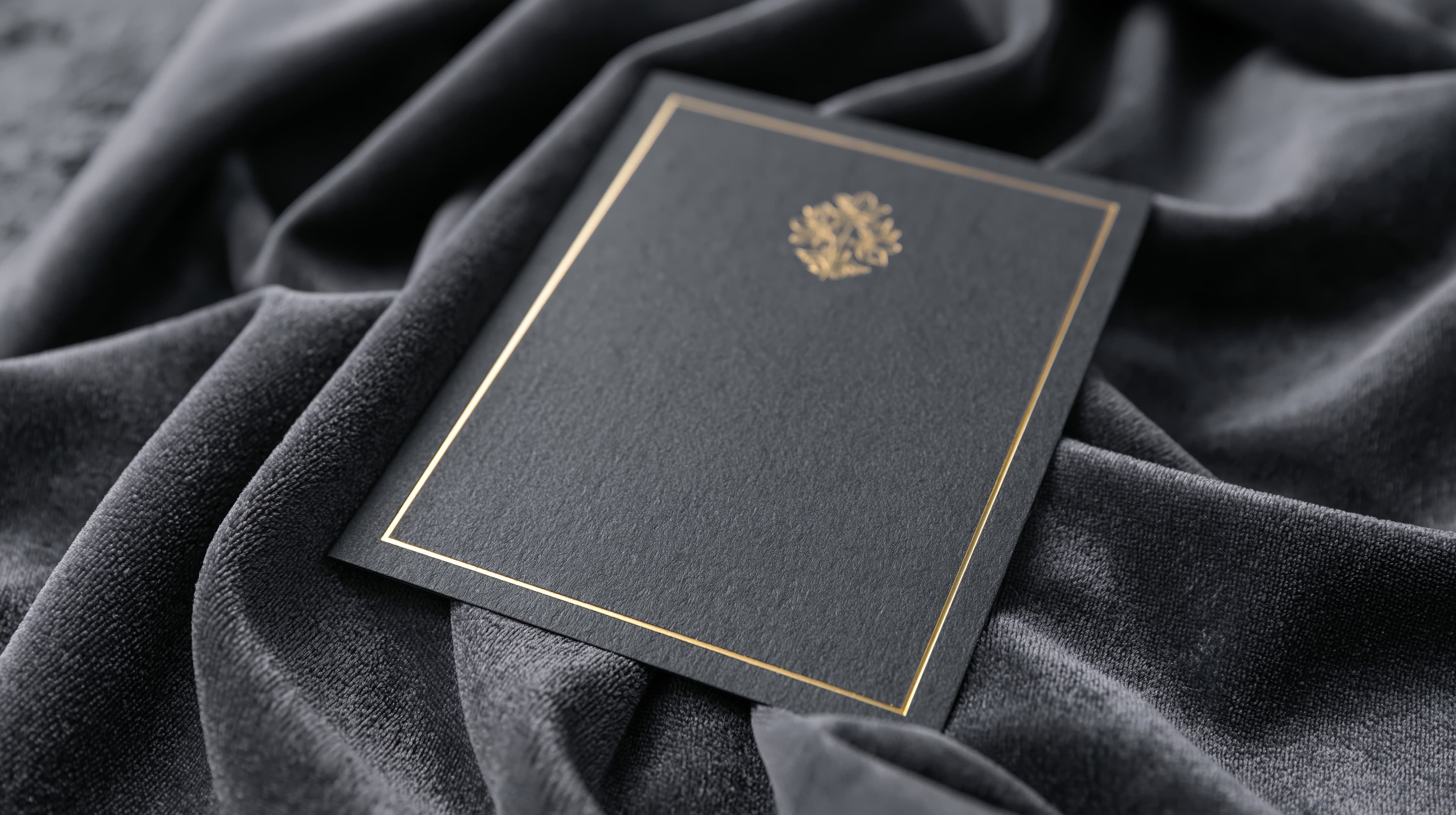
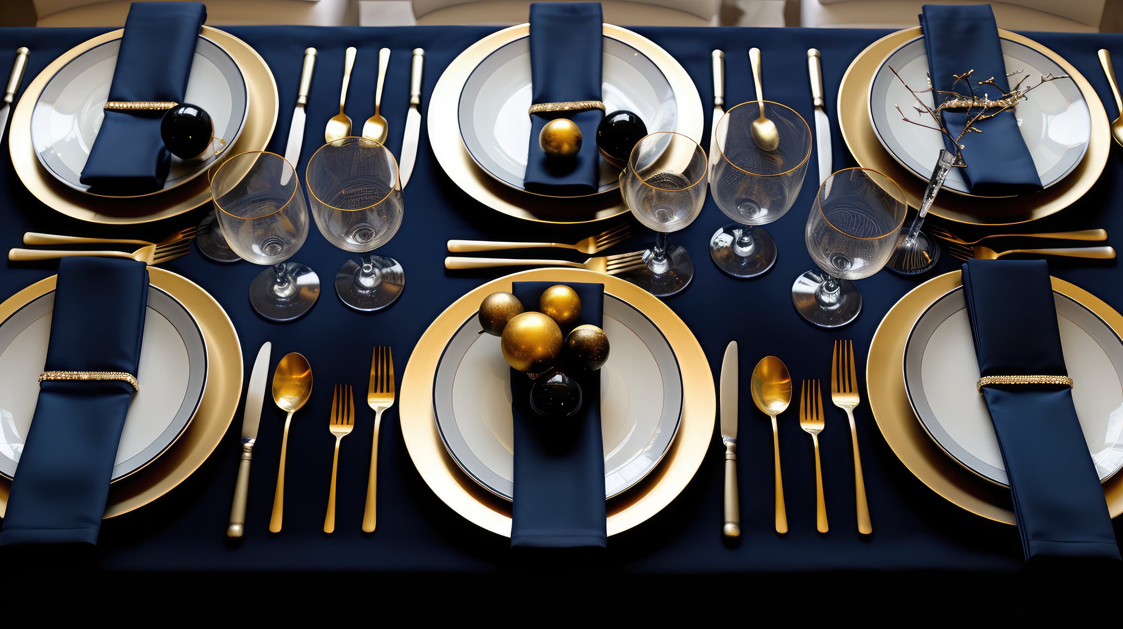
Formal. A structured evening with a clear arc — arrival, seating, dinner, dessert. Guests are expected to dress up, arrive on time, and stay for the full evening. The invitation should feel considered and refined: dark or rich palette, serif typography, clear structure in the wording. "Kindly RSVP by [date]" instead of "Let us know."
Polished casual. A well-planned evening that doesn't require a suit or a gown, but where the host has clearly put thought into the experience. Think: smart casual dress code, a set dinner time, a curated menu. The invitation should feel warm and intentional: a sophisticated palette, clean typography, genuine but composed wording. "Please join us" rather than "Come over" or "You are cordially invited."
Relaxed. An open-format gathering where guests arrive within a window, serve themselves, and leave when they're ready. The invitation should feel easy and approachable: lighter palette, modern or rounded typography, concise wording. "Come see the new place" rather than "Request the pleasure of your company."
Open house. A wide-window event where guests are expected to drop in, not stay for the duration. The invitation should communicate the window clearly and signal that the commitment is light: "From 3 PM onwards" with a food plan that works for grazing. The design can be casual or warm, but never formal — formality implies a structured evening, which is the opposite of what an open house offers.
Drop-in. The most casual end of the spectrum — barely an event, more of an ongoing invitation. "We're having people over Saturday afternoon, come by if you're free." This often doesn't need a designed invitation at all — a text message is appropriate. But if the host does send a designed card (because it's a housewarming, or a holiday, or they want to make it feel special despite the casual format), the design should be visibly relaxed. A formal card for a drop-in gathering confuses the guest more than no card at all.
How design signals tone
The guest reads the invitation's tone primarily through three visual channels, usually before they've read the first line of text.
Color and contrast. Dark backgrounds signal formality and intention. Deep navies, blacks, jewel tones, and rich gradients carry visual weight that tells the guest this is a considered occasion. Light backgrounds — blush, ivory, soft neutrals — signal warmth and openness. Bright, saturated palettes signal energy and celebration. The color palette is the single strongest signal of tone.
Typography. Serif fonts (Playfair Display, Lora, Garamond) signal tradition and formality. Sans-serif fonts (Montserrat, Roboto, Poppins) signal modernity and approachability. The weight matters too — heavy, bold type feels confident and festive; light type feels delicate and intimate. And text case carries meaning: full uppercase reads as formal or bold; sentence case reads as personal and warm.
Density and space. A card with generous white space, a single central text block, and no decorative elements signals clean, modern formality. A card with a frame, a texture, and layered elements signals richness and occasion. A card with minimal structure and relaxed typography signals ease. The amount of space around the text tells the guest how much importance to assign to the evening.
When these three channels align — dark palette, serif font, generous spacing — the signal is unambiguous. The guest knows this is formal. When they conflict — dark palette, playful font, dense layout — the signal is mixed, and the guest doesn't know what to expect.
How wording signals tone
The visual tone tells the guest what kind of evening to anticipate. The wording confirms it — or contradicts it.
Formal wording is characterized by full names, complete sentences, and specific language. "[Names] request the pleasure of your company" is unmistakably formal. "Kindly RSVP by [date]" is formal. "Dinner will be served" is formal. Every element is precise and composed.
Casual wording is shorter, warmer, and more conversational. "Come see the new place" is casual. "Let us know if you can make it" is casual. "Food and drinks on us" is casual. The language is direct and personal.
The risk zone is when the visual and verbal tones disagree. A dark, serif-set, formally designed card with the wording "Come hang out at our place!" sends a contradictory signal. The guest sees formality in the design and casualness in the words and doesn't know which one to trust. Conversely, a bright, casual card with "Kindly respond at your earliest convenience" creates the same kind of mismatch — the words are formal, the design says otherwise.
The simplest rule: match the register of the wording to the register of the design. A formal card deserves formal language. A casual card can use casual language. The guest should receive one signal, not two.
The dress code question
Dress code is the single most common source of guest uncertainty, and it's the area where the invitation's tone does the most work.
Most events don't include an explicit dress code on the invitation. Guests are expected to infer it from the overall tone — the design, the wording, the venue, the time of day. This inference is usually correct, but it leaves room for doubt, which is why "what should I wear?" is the most frequently asked pre-event question after "what time?"
There are three approaches, and each is valid.
State it explicitly. "Attire: smart casual" or "Festive attire welcomed" or "Come as you are" — one line on the invitation removes all guesswork. This is the most considerate approach for events where the dress code matters (formal dinners, celebrations where traditional attire is appropriate, themed evenings).
Let the design do it. A deeply formal invitation — dark palette, serif type, structured wording — implicitly communicates that guests should dress up. A bright, relaxed invitation implicitly communicates that casual is fine. If the design is clear enough, the explicit line isn't necessary. This works best for events that fall clearly on one end of the spectrum.
Address it separately. For events where the dress expectation might not be obvious — a housewarming where the host would love to see festive attire but doesn't want to require it, or a dinner where "smart casual" could mean different things to different guests — a brief note in the body text or on the event page handles it without making it a formal line item on the card.
The worst approach is silence when the tone is ambiguous. A polished-casual event where the invitation looks somewhat formal and includes no dress guidance produces a room where half the guests are overdressed and half are underdressed. Neither group is wrong — the invitation failed to set the expectation clearly.
Time signals tone
The time of an event signals formality as much as the design does, and the two should agree.
An evening event starting at 7 PM suggests a structured evening — dinner is implied, departure is late. A Saturday afternoon event starting at 2 PM suggests a relaxed gathering — food is lighter, the window is open, families might attend. A Sunday morning event suggests brunch, which carries its own set of expectations.
When the time and the design tell different stories, the guest is confused. A dark, formal invitation for a 1 PM Saturday gathering feels mismatched. A bright, casual invitation for a 7:30 PM Saturday evening undersells what might be a beautiful dinner.
The alignment doesn't need to be heavy-handed. It's enough that the overall impression — color, type, wording, time, food plan — points consistently in the same direction. When everything says "this is a relaxed afternoon," the guest knows exactly what they're walking into. When everything says "this is a considered evening," they know that too.
Setting the right signal
The strongest invitations don't tell guests what to expect. They show them. The design, the wording, and the details work together to create a single, clear impression that calibrates every decision the guest makes — from what they wear to when they arrive to how long they plan to stay.
Every Cordiale invitation starts with a vibe — a mood that sets the palette, the font, and the tone of the card. Formal occasions get formal signals. Casual gatherings get casual ones. The guest reads the invitation and knows, without asking, what kind of evening to prepare for.
Free. Under two minutes. Create yours →
More on design and events: What Your Invitation Says About Your Event · Why the Best Events Have a Visual Identity · The Case Against Templates.
Ready to create your invitation?
Pick a vibe and the whole invitation designs itself. Free, no account, no app — for you or your guests.