What Is a Vibe? And Why It's Not a Template
Cordiale doesn't give you templates. It gives you vibes — a mood that sets the palette, the font, the texture, and the feel. Here's what that means and why it matters.
What Is a Vibe? And Why It's Not a Template
Most invitation platforms start with a layout. A finished card — fonts chosen, colors set, elements arranged — where you fill in your details and send it. That's a template. It works. It's also why every invitation made on the same platform looks like every other invitation made on the same platform.
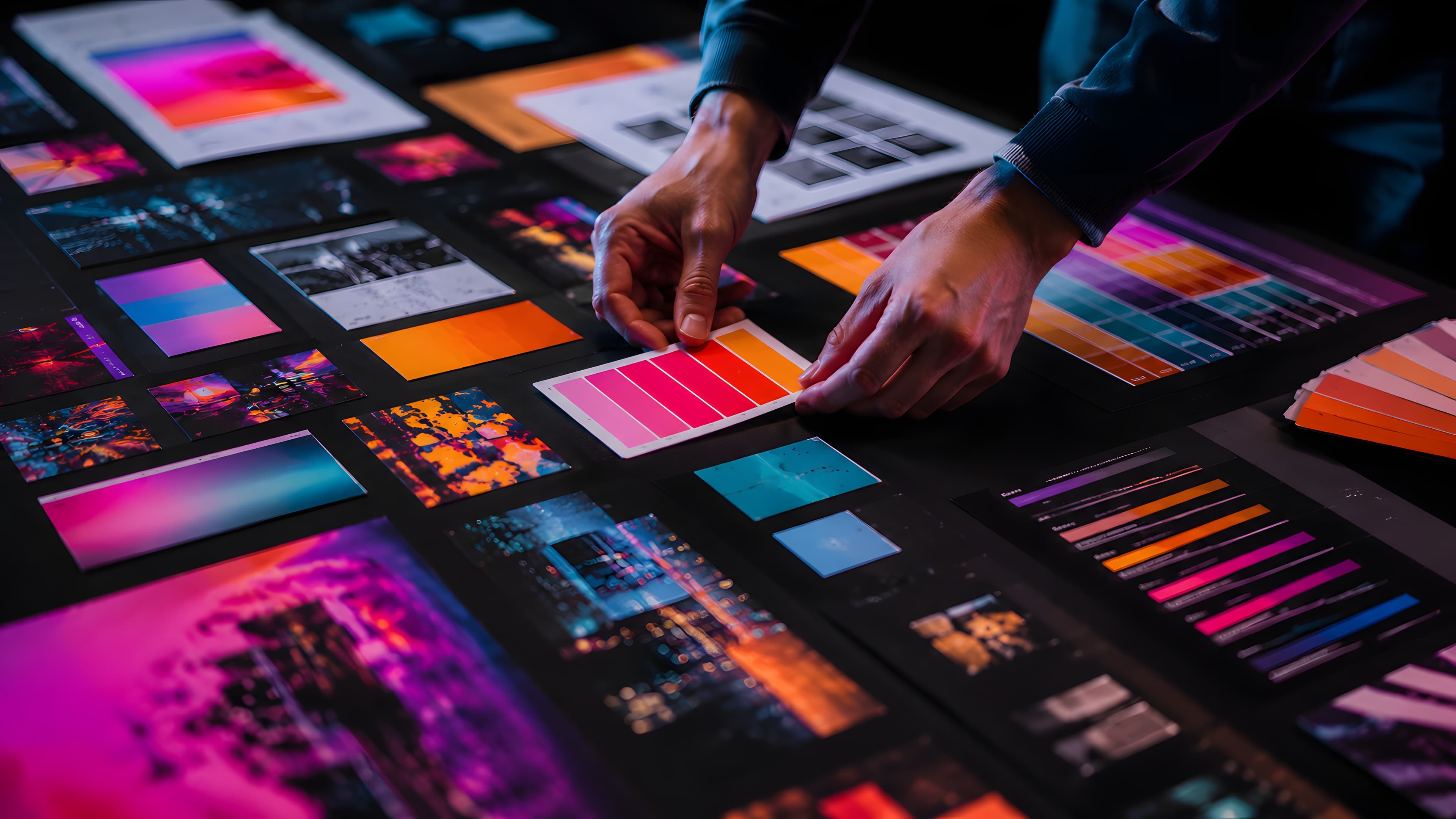
Cordiale starts somewhere different. Instead of choosing a finished design, you choose a mood — what we call a vibe. The vibe sets the palette, the typography, the texture, and the visual personality of the card. Everything downstream — the gradient, the font weight, the button style, the case of the lettering — is derived from that single choice.
This isn't a cosmetic distinction. It's a structural one. And it's the reason two people can use Cordiale for the same occasion and arrive at invitations that look nothing like each other.
A vibe is a design system, not a design
A template is a finished artifact. It has a fixed layout, a fixed color scheme, a fixed font, and a fixed visual identity. You can adjust the colors or swap the font, but the underlying structure — the proportions, the spacing, the logic of the design — stays the same. The template's personality is baked in.
A vibe is not a finished artifact. It's a set of rules that generate artifacts. It defines a font family, a gradient angle, a text case, a texture default, and a personality — but it doesn't define a single layout. It defines the visual language, and the card is composed within that language based on the host's choices.
This means the vibe is the starting point, not the end point. Two hosts who both choose the same vibe will arrive at different cards because they'll choose different palettes, different frames, different textures, different title sizes. The vibe ensures that whatever they choose coheres — the palette works with the font, the texture suits the mood, the frame complements the gradient — without the host needing to think about any of that.
The host makes creative decisions. The system ensures those decisions work together.
The six vibes
Each vibe has a distinct character, defined by its font, its gradient behavior, and the kind of occasion it naturally suits.
Spark uses Nunito — rounded, bold, warm. The gradients are vivid and angled. The text is uppercase. The personality is fun, vibrant, and festive. Spark is the vibe for birthday parties, casual get-togethers, and celebrations where the energy is the point.
Modern uses Roboto — clean, geometric, restrained. The gradients are radial, centered, and often muted. The personality is minimal and sophisticated. Modern suits corporate events, contemporary dinners, and any occasion where elegance means simplicity.
Blush uses Lora — a serif with warmth. The gradients are soft, vertical, and light. The text is sentence case, not uppercase — the only vibe that makes this choice. The personality is romantic and dreamy. Blush is built for bridal showers, intimate celebrations, and occasions where softness is the tone.
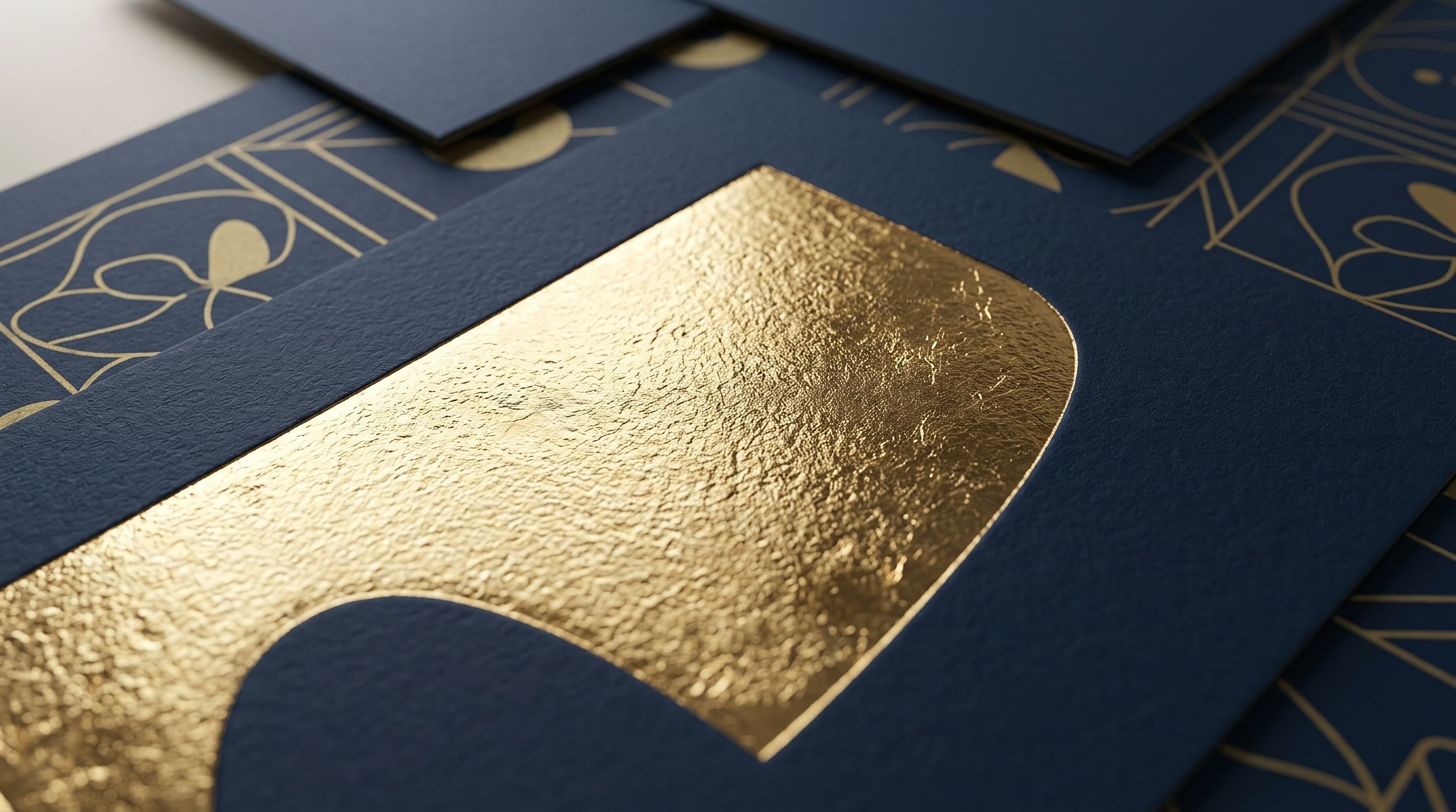
Regal uses Playfair Display — a high-contrast serif with authority. The gradients are dark and deep. The letter-spacing is wide. The personality is grand and luxurious. Regal suits formal dinners, milestone celebrations, and events where the invitation should feel like an occasion in itself.
Deep uses Montserrat — bold, geometric, confident. The gradients are dark with neon accents — electric blues, vivid pinks, acid greens. The personality is dramatic and modern. Deep suits nighttime events, launch parties, and any occasion where the mood is bold.
Festive uses Poppins — friendly, balanced, celebratory. The palettes are occasion-mapped — specific colors for Diwali, Christmas, Holi, Eid, Lunar New Year, Halloween. The personality is cultural and seasonal. Festive is the vibe that understands that a Diwali party and a Christmas party are both celebrations, but they are not the same celebration.
What the vibe controls
When a host selects a vibe, six things are set in motion.
Typography. The font family, weight, and letter-spacing are locked. A Spark card always renders in Nunito at 800 weight with tight spacing. A Regal card always renders in Playfair Display at 700 weight with wide spacing. The host never has to choose a font — the vibe chose it for them, and the choice is intentional.
Palette range. Each vibe has its own set of palettes — roughly 20 to 26 per vibe, 138 in total. The palettes within a vibe are designed to work with that vibe's font and gradient angle. A Deep palette wouldn't make sense on a Blush card, and the system doesn't offer it.
Gradient behavior. Each vibe has a characteristic gradient angle — Spark at 150°, Modern as a radial, Blush at 180°, Deep at 135°. The palette provides the colors; the vibe provides the direction and shape. This is why two cards with similar color ranges but different vibes look distinct — the gradient logic is different.
Texture default. Regal defaults to a brushed texture. Blush defaults to silk. Others default to none. The host can change this, but the default already matches the vibe's character.
Button styling. The radius, case, weight, and letter-spacing of the RSVP button are vibe-specific. Spark gets a fully rounded, uppercase, bold button. Regal gets a squared, wide-tracked, uppercase button. The button feels like it belongs on the card because the vibe defined it.
Border and frame filtering. Not every decorative option is available in every vibe. The glow border only appears in Deep. The double border appears in Regal and Festive but not Spark. This filtering is intentional — it prevents the host from selecting a decorative element that would fight the vibe's personality.
The combinatorial result
The practical consequence of this system is scale without repetition.
A template library offers a fixed number of options. Two hundred templates means two hundred possible invitations, and every host who selects template #47 produces the same card with different text.
A vibe system offers combinatorial options. Six vibes, each with 20+ palettes, combined with 32 scenes, 25 frames, 3 blend modes, 5 border styles, 4 textures, 5 animations, and 13 title sizes — the math produces approximately 130 million unique configurations.
Not all of those are equally good. But the system is designed so that no combination within a vibe is actively bad. The filtering and defaults ensure coherence. The host explores within safe boundaries, and every path through those boundaries produces a card that looks designed, not generated.
This is the fundamental difference between a template and a vibe. A template says "here is a design; make it yours by editing the details." A vibe says "here is a visual language; compose your own design within it." The first produces recognition. The second produces originality.
Why it matters to the guest
The host experiences the vibe as a creative tool. The guest experiences it as a first impression.
When an invitation arrives that looks like something the guest has seen before — the same Evite layout, the same Paperless Post frame, the same Canva template their neighbor used last month — the impression is "this was convenient." It's fine. It's not memorable.
When an invitation arrives that looks like nothing the guest has seen before — a unique combination of color, typography, and mood that feels specific to this event — the impression is "this was intentional." The guest hasn't thought about design systems or combinatorial axes. They've simply received something that feels like the host cared, and that feeling carries into the event before it even begins.
That's what a vibe is for. Not to give the host more options for the sake of options. To give the guest the feeling that this event, this evening, this invitation was considered — and that the experience will be too.
Try it
Pick an occasion. Choose a vibe. Watch the card design itself around the mood you set. Every palette, font, and frame you see is filtered to work together. What comes out is yours — not a template, not a layout someone else also used, but a card that looks like the event it represents.
Free. Under two minutes. Create yours →
More on Cordiale's design approach: The Case Against Templates · What Your Invitation Says About Your Event. See how the invitations work for guests: One Link. No App. No Account.
Ready to create your invitation?
Pick a vibe and the whole invitation designs itself. Free, no account, no app — for you or your guests.