Free Invitations That Don't Look Free
Most free invitation tools look free — watermarks, generic templates, limited fonts. Here's what happens when a free tool is designed to produce cards worth keeping.
Free Invitations That Don't Look Free
There's an unspoken hierarchy in online invitations, and everyone who's used them knows it. The free tools look free. The paid tools look better. And the best-looking invitations were made in a design tool like Canva by someone with an eye for it — but they don't collect RSVPs, so you're back to managing responses by hand.
This hierarchy exists because most free invitation platforms treat design as a feature tier. The best templates, the best fonts, the best colors, the best features — these are reserved for paying users. What's left for the free tier is functional but unmistakably budget: a limited color palette, a generic font, and often a watermark or branding badge that tells every guest exactly which platform made the card.
The result is that "free online invitation" has become shorthand for "good enough but not impressive." Hosts who care about how their invitation looks either pay for a premium plan or leave the platform entirely and design something in Canva — which solves the design problem but creates the RSVP problem.
Cordiale was built on a different premise: the free version should look like the only version.
The watermark problem
The most visible marker of a free-tier invitation is the platform's branding on the card. A "Made with [Platform]" badge, a watermark, or a footer link that the host can't remove without upgrading. The host sees it and knows it's there. The guest sees it and knows the host used a free tool.
This branding serves the platform — it's advertising on every invitation that gets shared. It does not serve the host. For the host, it undermines the card. An invitation that says "Made with [Platform]" is an invitation that also says "I didn't pay for this." That message runs counter to everything the design is trying to communicate — that the event was considered, that the host cared, that the evening is worth showing up for.
Cordiale includes a small "Made with Cordiale" link in the footer of the guest page — not on the card itself. The keepsake card the guest sees is entirely the host's design, with no platform branding, no watermark, and no visual indicator of which tool produced it. The card looks like it was designed for the event, because it was.
Design quality as the default
Most free platforms limit design quality by constraining the inputs. Fewer fonts. Fewer colors. Fewer layout options. The premium tier unlocks better typography, richer palettes, and more sophisticated layouts. The free tier gets what's left.
This creates a visible quality gap between free and paid invitations on the same platform — which is, of course, the point. The gap is the incentive to upgrade.
Cordiale doesn't have a premium tier for design. Every vibe, every palette, every frame, every texture, every animation, every border style is available to every host. The six typefaces — Nunito, Roboto, Lora, Playfair Display, Montserrat, Poppins — are all available. The 138 palettes are all available. The 25 frames, the 32 scenes, the blend modes, the border styles — all of it, free.
The design system that produces the card is the same for every host. There is no degraded version. A card made on Cordiale looks the way it looks because the system is designed to produce good results by default — not because the host paid for the privilege.
Why free works
The question most people ask is: if everything is free, what's the business model?
The honest answer: Cordiale is building a platform, not selling invitations. The invitation is the entry point — the thing that gets a host to create an event, share a link, and introduce their guests to the product. Every invitation shared is a free introduction. Every guest who has a good experience is a potential future host. The growth model is product-led: the product markets itself through use.
A premium tier exists on the roadmap — features like custom URLs, branding removal, and advanced analytics — but the core experience (design, RSVP, guest tracking, the guest page) remains free. The distinction is between the core event experience and the administrative layer around it. Creating an invitation that looks beautiful and collects RSVPs will always be free. Managing events at scale, with advanced tools, will eventually be paid.
This is the same model that built some of the most widely used tools on the internet. The free version is genuinely good — not a trial, not a teaser, not a restricted demo. It's the product.
What "looks free" actually means
The difference between a free invitation that looks free and one that doesn't comes down to four things.
Typography. Free platforms default to system fonts or a small set of generic web fonts. The result is cards that look like a formatted email. A considered typeface — one chosen for the mood of the card, with intentional weight and spacing — immediately elevates the design. Cordiale assigns a typeface per vibe: Playfair Display for formal occasions, Lora for romantic ones, Montserrat for bold events. The font isn't a decorative choice. It's a design decision.
Color. Free platforms typically offer a color picker or a small palette of presets. The host either picks colors that don't work together or uses the defaults, which are designed to be inoffensive rather than interesting. Cordiale's palettes are designed compositions — two or three colors selected to work together as a gradient, with a text color calibrated for contrast. The host doesn't pick individual colors. They pick a palette that's already been art-directed.
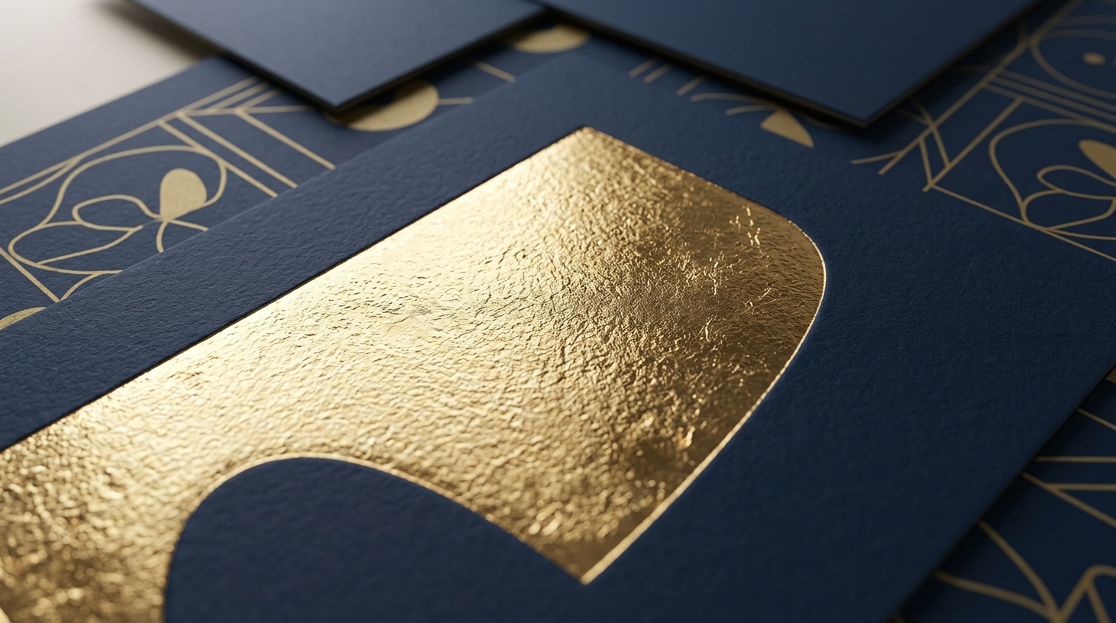
Texture and depth. Most free invitations are flat — a background color with text on it. Adding depth (a gradient, a texture, a frame, a glass effect) requires either a premium tier or a separate design tool. Cordiale's card system includes textures, frames with blend modes, glass morphism, animations, and border styles in the free tier. The card has dimension.
Coherence. The most telling sign of a free tool is when the elements of the design don't work together — a font that fights the background, a color that clashes with the layout, a decorative element that feels pasted on rather than integrated. Cordiale's vibe system filters every option through the mood the host selected, so every combination of palette, frame, texture, and border is guaranteed to cohere. The card doesn't look assembled from free parts. It looks designed.
The guest's impression
Ultimately, "looks free" is not about the host's experience of the tool. It's about the guest's impression of the card.
A guest who opens a link and sees a beautifully designed invitation — rich color, considered typography, depth and texture, no watermark — forms an impression of the event before they read a word. The impression is: this was considered. This host cared. This evening is worth anticipating.
A guest who opens a link and sees a generic template with a platform watermark forms a different impression. The impression is: this was easy. It may have been — but that's not the feeling a host wants their invitation to carry.
The design should communicate the host's intention, not the tool's price tier.
Make one
Every feature. Every font. Every palette. Every frame. No watermark on the card. No premium gate on the design.
Free. Under two minutes. Create yours →
More on Cordiale: What Is a Vibe? · One Link. No App. No Account.. See the design philosophy: The Case Against Templates.
Ready to create your invitation?
Pick a vibe and the whole invitation designs itself. Free, no account, no app — for you or your guests.